Hi Gainium,
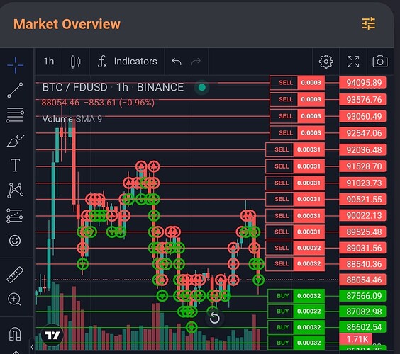
Consider this chart :
Improvement could be quickly done. Here are my problems with current icons :
- too thick : don’t see candles
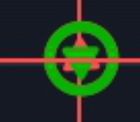
- can’t correctly see when buy and sell at a same position (you just barely see 2 mini triangle in another color, and even worse if the candle’s body is under)

Edit : I think it would be nice to have icon with circle (as now) but where arrow is not just centered but use the half top or half bottom of the circle internal area. This will be easier to detect buy and sell positions even if both occurred at same price and candle.
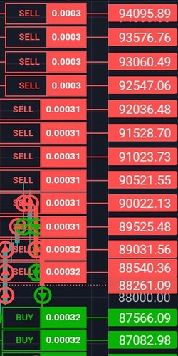
Edit 2 : another cool optimisation would be on buy and sell price that display that it’s a sell or a buy where we already know that (coz red, could be dropped). Then the amount value hide all where it could be transparent (like words sell or buy). At the end, the margin where the current candle is drawn could be reduced to print more candles on the same screen (nothing to hide candles).
Thx

