Hi Gainium,
So I think we can improve the user experience for users on phone.
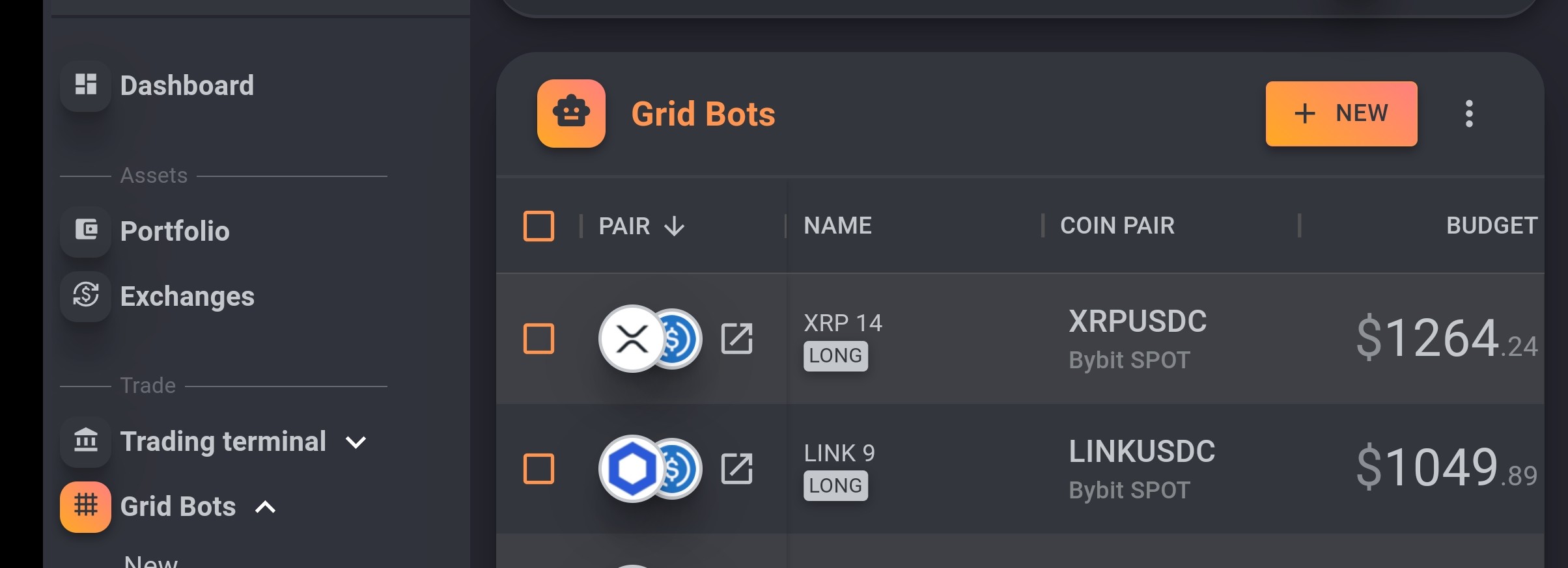
Take a look at those 2 pictures (landscape or not) :
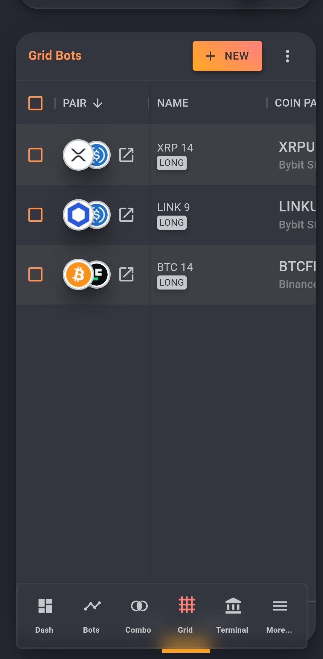
My concern is that on a phone, there is not a lot space and we waste it, making it more complicated while we have to update things. All related to grid bot list.
Column with pair name is having a link to open in another tab. That’s nice but it add more pain for phone users : maybe split that into another column (so we can hide it)?
Column use extra width to display nothing. We should be able to use the strict required width without any extra white space.
Columns can’t be shrinked, it would be nice to let user enforce that, even if text is no more readable.
The column pair name is always on and can’t be hidden (the idea was to use the name instead of pair and pin left).
Also, since several days (weeks?), browser is no more able to restore previous column setting. I mean I have to re-add the filter to open, closed and range status.
In landscape mode, it would be nice to hide the left menu coz it consume lots of screen space.
If any of those are possible, it would be nice improvement in my mind.
Thx